渐变 (gradients) 可以在两个或多个指定的颜色之间显示平稳的过渡,用法与 CSS 渐变一致。
当前框架支持以下渐变效果:
创建一个线性渐变,需要定义两类数据:1) 过渡方向;2) 过渡颜色,因此需要指定至少两种颜色。
direction或者angle两种形式指定过渡颜色:支持后面四种方式:red、#FF0000、rgb(255, 0, 0)、rgba(255, 0, 0, 1)
direction: 方向渐变
background: linear-gradient(direction, color-stop1, color-stop2, ...);
background: repeating-linear-gradient(direction, color-stop1, color-stop2, ...);
background: linear-gradient(angle, color-stop1, color-stop2);
background: repeating-linear-gradient(angle, color-stop1, color-stop2);
| 名称 | 类型 | 默认值 | 必填 | 描述 |
|---|---|---|---|---|
| direction | to <side-or-corner><side-or-corner> = [left | right] || [top | bottom] | to bottom (从上到下渐变) | 否 | 例如:to right (从左向右渐变)例如: to bottom right (从左上角到右下角) |
| angle | <deg> | 否 | 以图形几何中心为原点水平为 X 轴建立坐标,渐变线与 Y 轴的夹角(按顺时针计算)。 | |
| color-stop | <color> [<length>|<percentage>] | 是 | 从起点到stop的区域显示的背景色为color |
#gradient {
  height: 100px;
  width: 200px;
}
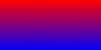
/* 从顶部开始渐变。起点是红色,慢慢过渡到蓝色 */
background: linear-gradient(red, blue);
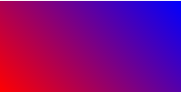
/* 45度夹角,从红色渐变到蓝色  */
background: linear-gradient(45deg, rgb(255, 0, 0), rgb(0, 0, 255));
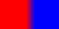
/* 从左向右渐变,在距离左边90px和距离左边120px (200*0.6) 之间30px宽度形成渐变*/
background: linear-gradient(to right, rgb(255, 0, 0) 90px, rgb(0, 0, 255) 60%);
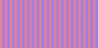
/* 从左向右渐变,重复渐变区域10px(20-10)透明度0.5 */
background: repeating-linear-gradient(
  to right,
  rgba(255, 0, 0, 0.5) 10px,
  rgba(0, 0, 255, 0.5) 20px
);